Client
Ziglu
Industries
Fintech
Year
2023
Summary
Project Overview
With Ziglu app you can hold multiple (traditional/foreign and digital) currencies in a single account. You can buy and sell foreign currency at interbank rates, and buy or sell crypto at the best price across multiple exchanges — guaranteed. No more complex transactions, and no more rip-off rates or fees. You can also spend any currency you hold — including crypto — instantly anywhere using your Mastercard debit card.
My Role
Working as part of a two designer team, my role was to lead the design to create Ziglu app alongside working with marketing team to design the new brand and other marketing materials. Design process I followed: Discover, Define, Develop, Deliver.
Key deliverables
A number of deliverables were required for the project, including:
Initial project plan (AI)
Competitive analysis
User flow
Experience map
Wireframes
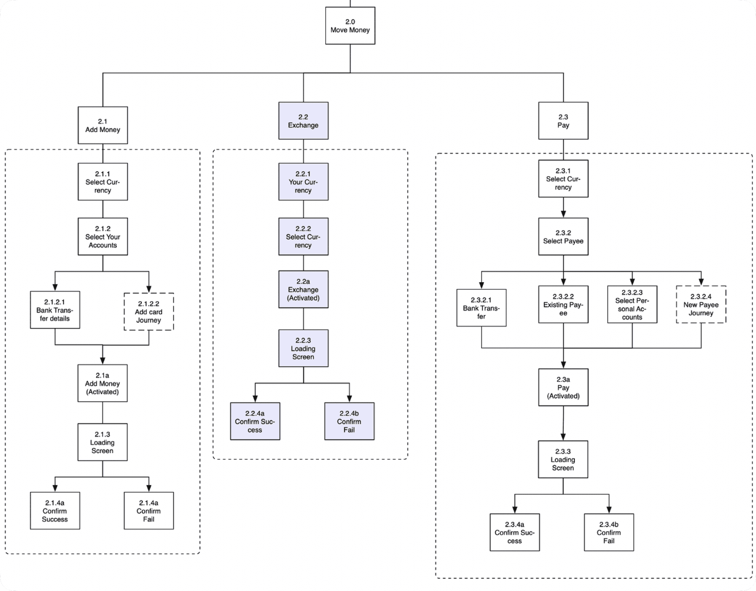
App map
Clickable prototype
Supporting Development team
Results
The design of the app provides users with the ability to:
Easily trade cryptocurrency
View the live market rates
View portfolio balance with deep insights
Exchange currencies interactive solution
Activity of your transactions in detail
Design Process
Competitive analysis
We started the project by understanding our client — Ziglu — and their competition. We analysed 5 competitors in the fintech space, with two identified as direct competitors, offering both crypto and open banking. Unique selling points were identified, build an app that breaks all the currency barriers — geographic and technological — and puts users fully in control of their money whatever you want to do with it. however, we needed to find out if users wanted these.
User research
Our user research consisted of four steps:
Preparation of interview questions
Interviewee recruitment (Focus Groups)
Conduct of user interviews
A key insight from our screening survey was how many users are familiar with crypto currency and how can we make them use the app on daily basis.
In total, we conducted 10+ Focus groups. A key challenge during this process was identifying users who were available at relatively short notice to conduct interviews.
Our Findings
Users requirements and pain points:
Users those were new to cryptocurrency world and how to make them use the app
Users needed help to understand how to add money to the app
Users would like to have savings pots to where they can transfer their daily profits
Users needed more deep dives on their account than just balance
Another key finding was that most of the users were familiar with the cryptocurrency concept and wanted something simple solutions which is easy to understand and gives enough details about their money if needed.
This really helped us to empathise with the users and understand their frustrations when using other crypto apps as well as identifying those positive aspects as well.
Ideating
Conducting focus groups we explored some ideas for the scenarios, subsequently using a feature prioritisation matrix to refine what should be included in the first release of the app. This showed there were unwanted features that were very time consuming and costly.
Navigation
We identified that users found the ‘Home’, ‘Activity’ , ‘Coin market’ , ‘Settings ’ tabs in the navigation very useful whereas ‘Move money button’ was very confusing for some. In order to clarify the move money, we removed the label, and made it more playful and interactive.
Improving rapidly
From the design process and the app map, we created a wireflow.
Usability testing also showed, for example, the overall progress was confusing. Removing it from this screen allowed us to implement a more important feature that increased user engagement: the ability to view daily profit/loss and giving insights about their portfolio.
Solution
The design process described above resulted in a high-fidelity prototype of the app made using Sketch, with the preview element animated in Principle to display that functionality. Some of the key flows of the app are shown below.


