Client
Swise
Industries
Fintech
Year
2023
Summary
Project Overview
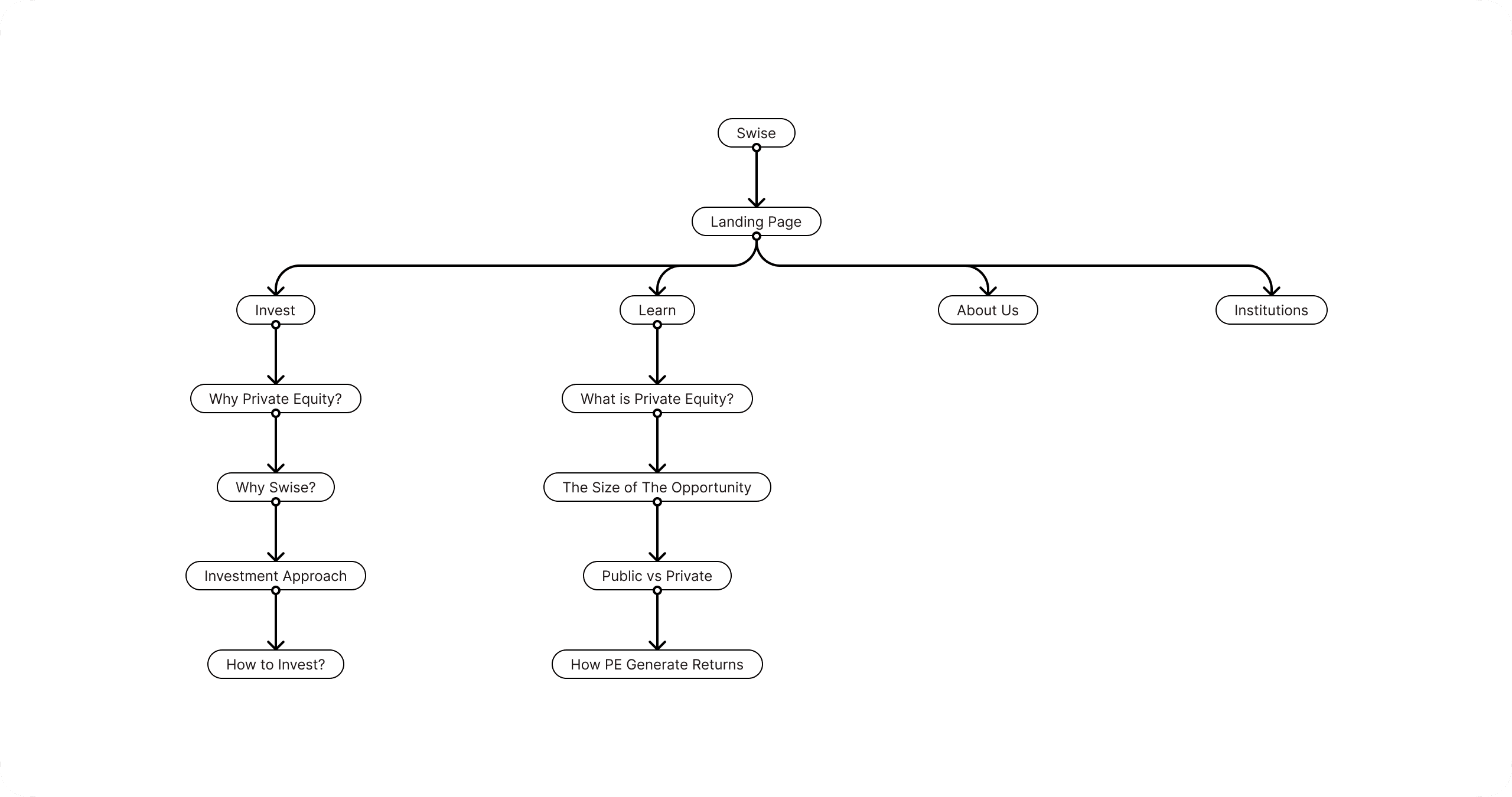
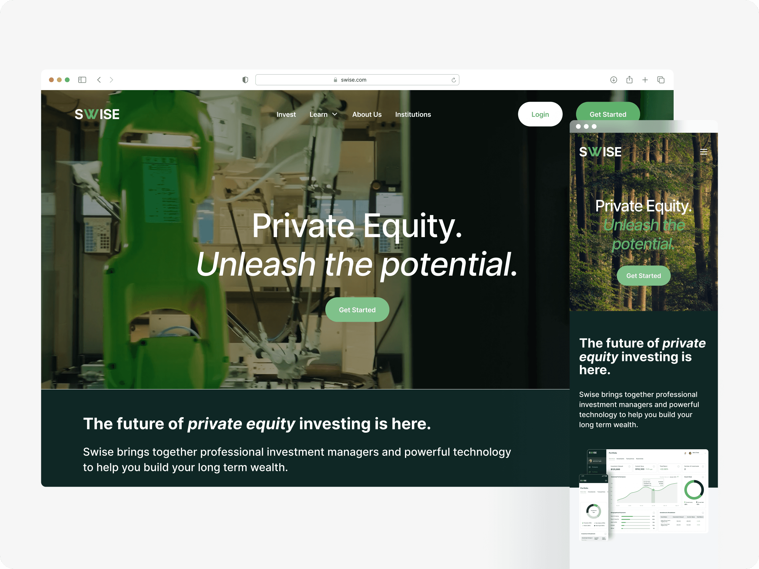
Swise.com was meticulously designed to serve as a digital bridge between users and the world of private equity investment. As a pivotal online platform for the renowned private equity fund company, Swise, the website's core ambition is to seamlessly blend the prowess of professional investment managers with advanced technology. This symbiosis aims to uncomplicate the wealth-building journey for its users, spotlighting Swise's unique offerings, especially its signature evergreen funds. The essence of the platform is to encapsulate the integrity, innovation, and expertise that Swise represents in the private equity realm.
My Role
As the lead designer for Swise.com, my primary responsibility was to breathe life into the digital embodiment of the Swise brand. Delving deep into the nuances of the B2B website realm, I meticulously crafted a design ethos that ensured the website's look and feel resonated perfectly with the sophisticated expectations associated with the private equity sector. Every design choice was made to echo Swise's brand integrity and to provide an intuitive, engaging experience for its professional clientele.
Key deliverables
Production-Ready Website: Spearheaded the design and conceptualisation of Swise.com to ensure it not only stands out but also aligns with the high standards of the B2B landscape in the private equity sector.
Integration with Framer: Utilising the capabilities of Framer, I built a dynamic website that goes beyond static visuals. This integration allowed for advanced design-to-code functionalities, ensuring a seamless transition from design mockups to live site.
Engaging Animations: To enhance user engagement and to breathe life into the design, I implemented subtle yet impactful animations throughout the site. These animations served to accentuate key elements and provide a more interactive and immersive experience for the visitors.
Design Process
Competitive analysis
The landscape of B2B websites within the private equity sector is marked by distinct design trends and professional aesthetics. To ensure Swise.com aligns with industry benchmarks while also carving out its unique digital identity, I embarked on a rigorous competitive analysis. This exploration not only provided insights into prevalent design elements but also illuminated effective ways to communicate financial sophistication and trustworthiness. With the client's specific vision for the website in mind, the challenge was to harmonise this acquired knowledge with their distinct style preferences. Striking this balance was paramount; it was essential to create a site that both resonated with the industry's professionalism and upheld the client's unique branding ideals.
Conclusion
Through a fusion of in-depth competitive analysis and a keen understanding of the Swise brand guidelines, the design journey of Swise.com was both strategic and tailored. The end result is a website that not only stands tall in the private equity B2B landscape but also truly encapsulates the essence of the Swise brand, marrying professionalism with a distinct identity.


